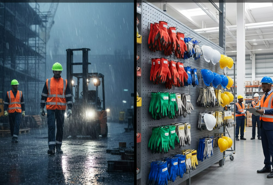
If you take a stroll through a warehouse, you’ll easily see this scene: yellow hard hats, orange reflective vests, dark gloves, and black safety shoes.
After a while, almost no one will stop to consider this question—
Were these colors chosen randomly?
Most people’s first reaction is:
“To be more eye-catching, easier to see.”
But anyone who has actually worked on the front lines knows that the impact of color goes far beyond just “looks good.”
I. Color is the fastest “language” in the warehouse
In the noisy, fast-paced, and instruction-heavy warehouse,
color is often faster than language.
- Forklift drivers can’t possibly identify everyone individually.
- Team leaders can’t possibly monitor every action at all times.
- New employees can’t possibly be familiar with all procedures.
But they can recognize colors in a second.
Color, in essence, is a “silent instruction.”
When used correctly, it’s a reminder; when used incorrectly, it’s misleading.
II. Why does “seeing” not equal “seeing clearly”?
Many warehouses choose colors for personal protective equipment (PPE) based on only one criterion: brightness.
However, this logic often fails in real-world scenarios.
Scenario 1: Bright Colors Easily Overlooked
- Yellow Hard Helmet
- Orange Ground Markings
- Red Warning Stickers
When the environment is already filled with highly saturated colors,
PPE blends into the background.
The result:
Visible, but not prominent.
Scenario 2: Problems with Dark-Colored PPE in Low-Light Environments
In areas with high shelves and insufficient lighting:
- Dark gloves make movement less noticeable
- Black shoes almost disappear in shadows
Choosing the wrong color won’t cause immediate problems,
but it will continuously weaken others’ ability to anticipate your movements.
III. Color is Affecting Employees’ “Sense of Security” and “Sense of Presence”
A rarely mentioned issue is:
Color affects employees’ perception of their own safety.
High-visibility colors don’t just make you “eye-catching,” they make you “seen.”
- New employees feel more at ease.
- Night shift workers experience less psychological pressure.
- Employees feel more confident interacting with vehicles and equipment.
Many veteran employees say,
“Wearing reflective clothing makes me feel more secure.”
This isn’t just a psychological effect;
it’s because the color constantly conveys a signal:
“Your position is being perceived.”
IV. Color also subtly shapes a sense of “order” in the warehouse.
In well-managed warehouses, colors often follow a logic:
- A certain color = a certain job type
- A certain color = a certain risk level
- A certain color = a certain work area
There’s no need to post many notices;
people naturally “stand in the right place.”
Conversely, if colors lack logic:
- Different job positions use mixed colors
- New and old models have conflicting colors
- Protection levels cannot be intuitively distinguished
Over time, employees’ emphasis on personal protective equipment will decrease.
V. The Impact of Color on “Violations” is Often Underestimated
A very real problem: Violations often occur when “no one is paying attention.”
And color, precisely, determines “attention.”
- When wearing highly visible colors,
- employees are less likely to commit obvious violations.
- It’s not about fear of punishment, but a stronger sense of being “seen.”
Conversely, when workwear colors are too understated:
- Weak presence
- Behavioral constraints naturally decrease.
Color is actually a gentle behavioral management tool.
VI. Why are some colors more acceptable to employees?
Many managers observe a phenomenon: For equally compliant workwear, some colors are more readily accepted.
The reason is simple:
- They don’t look “temporarily chosen,”
- They look more professional,
- They don’t appear cheap.
When the color of workwear makes employees feel “this is work equipment,”
rather than “something they’re forced to wear,”
their willingness to wear it naturally increases.
VII. More Colors Aren’t Always Better; They Must “Speak Clearly”
Some warehouses aim to improve management, but end up using more and more colors, creating even more chaos.
Truly effective color strategies often follow three principles:
- Each color has a clear meaning.
- Don’t arbitrarily change colors for the same meaning.
- The number of colors should be memorable, not based on instructions.
When colors begin to “speak human language,” communication costs in the warehouse will significantly decrease.
VIII. When Should You Re-evaluate the Colors of Personal Protective Equipment (PPE)?
You can ask yourself a few questions:
- Can forklift drivers identify workers at a glance?
- Can new employees easily integrate into the work environment?
- Are movements clear enough for night shifts or shaded areas?
- Do different positions “look the same”?
If the answers are not ideal,
the problem may not be with the system, but with the color design.
In conclusion: Color is an underestimated safety asset.
The colors of PPE are never just about “looks good.”
It affects:
- The speed at which something is seen
- The degree to which it is understood
- The feeling of being respected
In many situations, color doesn’t directly prevent accidents, but it can help dangers be detected earlier.
And this is where safety truly begins.
Leave a Reply